From an idea
to every
touchpoint.
Launching a skincare business through packaging, product photography, an online store, print, and social presence.
Built from the ground up.
Little Lavender needed more than a logo or a website. It needed to feel like a real, cohesive skincare business everywhere people met it.
I worked across the launch: the website, packaging and labels, product photography, business card, brochure, and Instagram presence. The identity connects a soft lavender palette and editorial type with simple, product-led imagery.
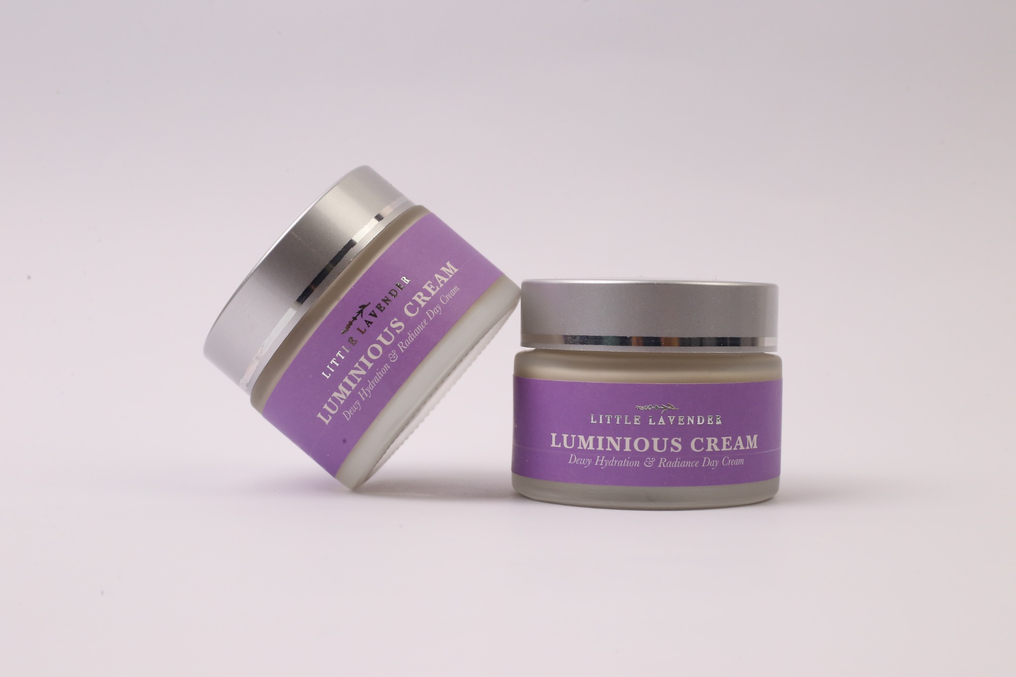
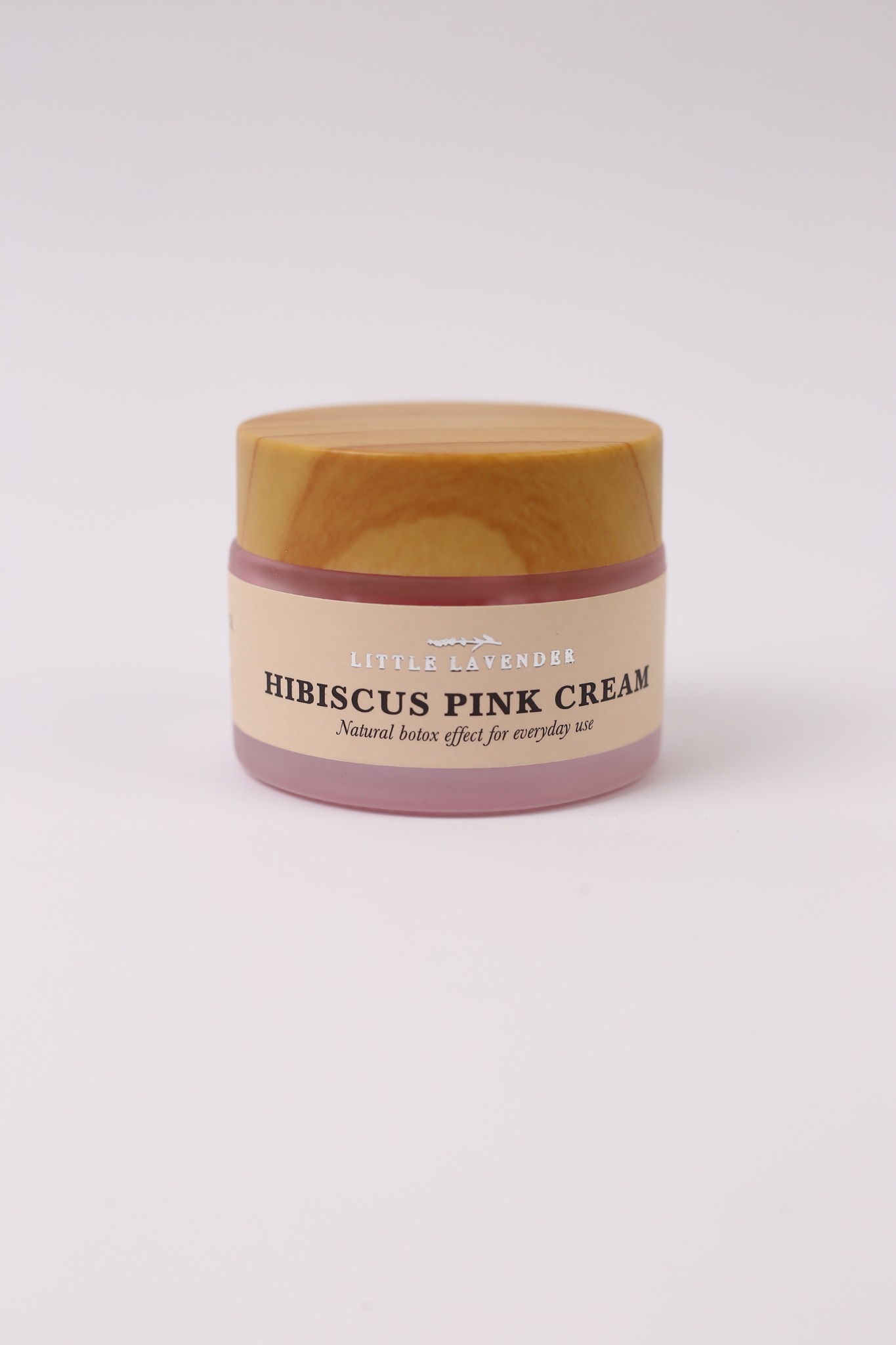
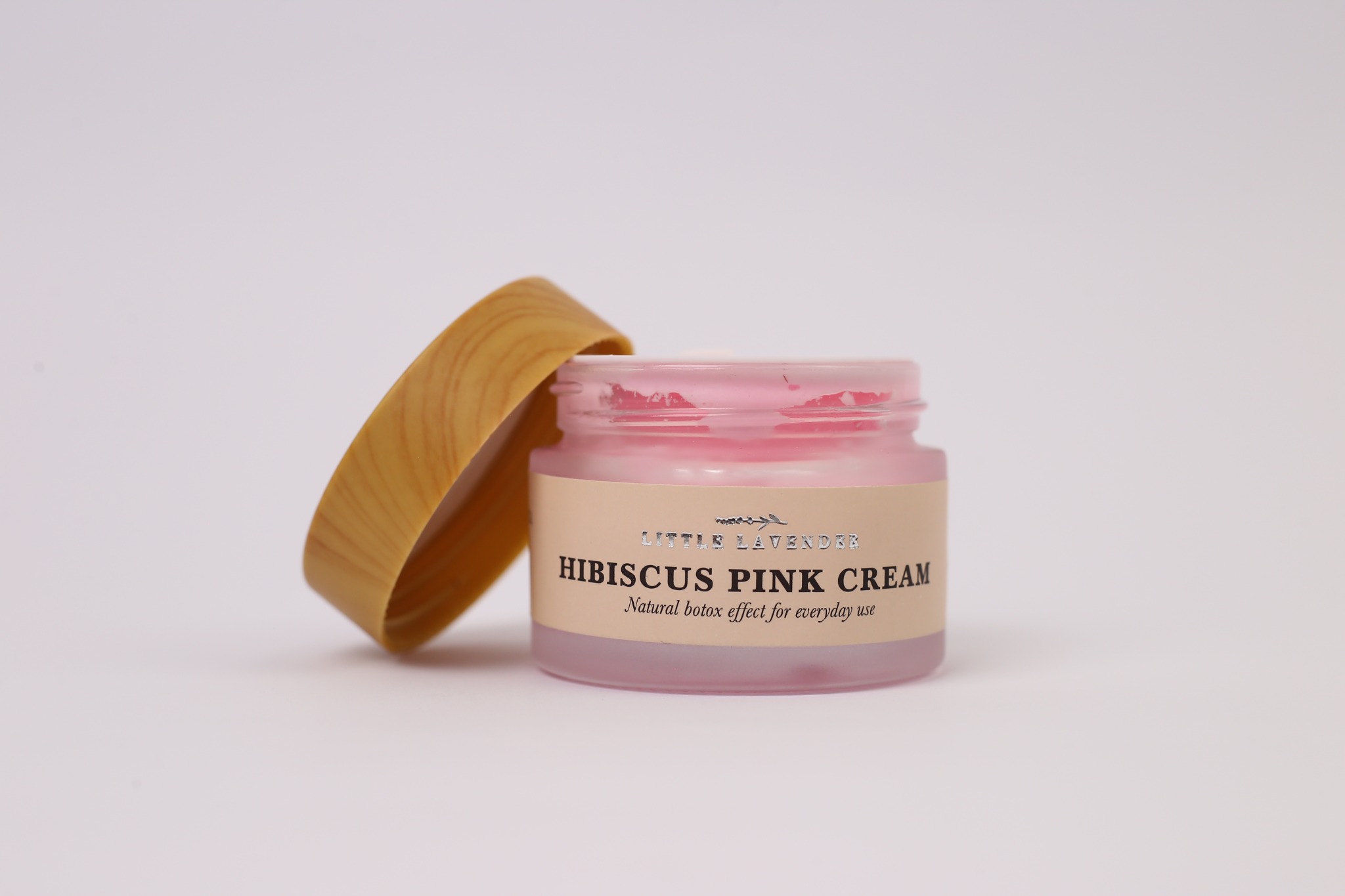
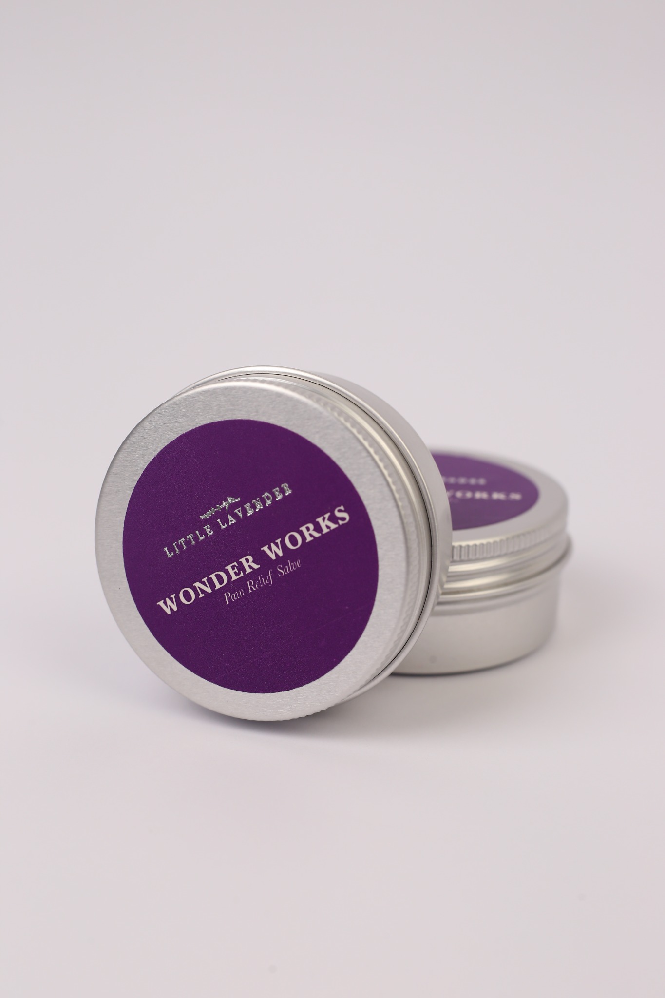
The product takes center stage.
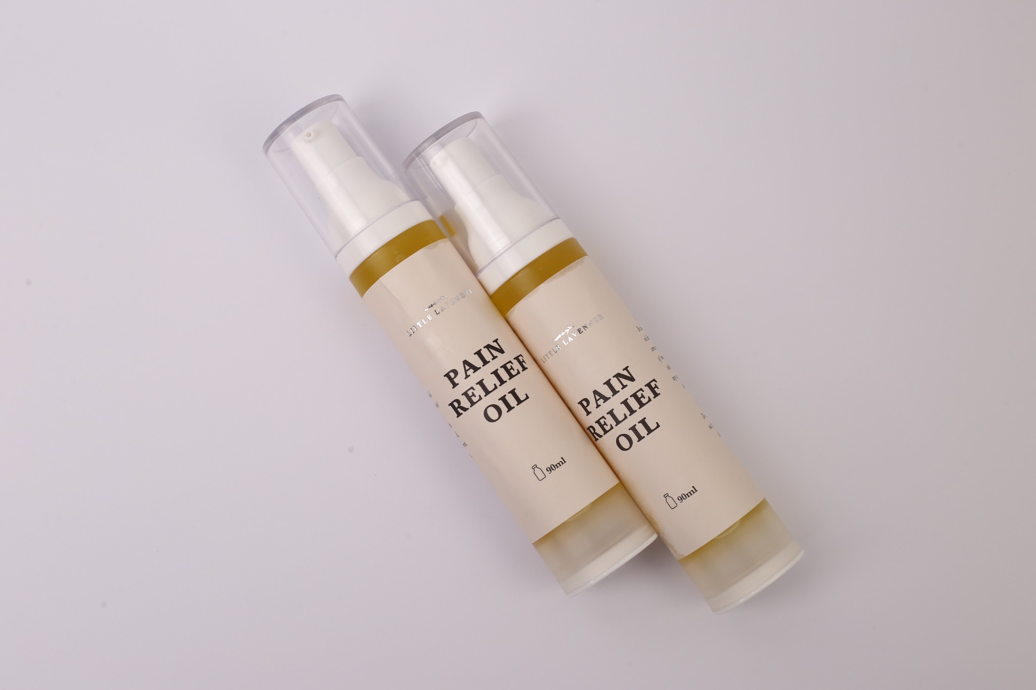
A clean, softly lit photographic set gives the packaging space to speak and keeps the different products connected as a family.
Moving gallery · Pause to inspect · Drag to explore
Identity you can hold.
Lavender is the recurring cue across jars, tins, bottles, and printed labels. The After Glow wrap shows how the product name, usage information, and brand mark work on a small physical surface.

A home for the whole range.
The live storefront brings the identity into an e-commerce journey, from category browsing and product discovery to the individual product pages. The view below is an illustrative presentation of the site.
Discover creams, serums, salves, and oils in one place.
Explore products ↗The same care, off-screen.
The business card and brochure extend the brand into a more tactile experience, with the same typography, botanical cues, and product imagery.

Inside the brochure.
